1. There was a man harassing other people in the subway, so 58 year-old Ki Suk Han confronted him about it. The man then pushed Han onto the tracks of the oncoming subway train. Hans was unable to lift himself out, so photographer R. Umar Abbasi began taking photos of the man to try to get the train to see the camera's flash and stop the train because he couldn't help Hans himself.
2. The photographer said he took the photo to try to tell the train that there was a man in the tracks and to stop. Abbasi was hoping the train would see his camera's flash and stop.
3. I think the photographer should've tried to help Hans out more instead of taking the photo. If I was that photographer I wouldn't have taken the photo.
4. I think it depends. If Abbasi really and truly couldn't have gotten Hans out in time, then I think he did. Abbasi tried his hardest to get the train's attention to stop, but it wasn't enough. I think the best thing he could've done was to help Hans out.
5. I disagree with the decision to put that photo on the cover because it's morbid. It's Hans last moments before he gets killed by the subway train. I think out of respect for his family, I would not run that photo on the cover. On the flip side to that, it's a very impactful image that might spark a lot of people's attention to buy that magazine, so I understand why they did.
6. As a photojournalist, capturing life as it happens is more important. Sometimes there are things that you can't change or that you can't help stop. The goal of a photojournalist is to capture images that tell a story and impact a viewer, and I think that this photographer did just that.
7. I think it's always acceptable to put yourself into a situation when other people need help whether you photograph it or not. I think this because I believe that every human should do what is necessary for them to help other people.
8. I think this depends on how severe the situation is. If the situation can cause extreme harm to a person, then yes I think photojournalists should avoid influencing this situation. On the other hand, if the situation is harmless, I don't see any problem with photojournalists taking out their cameras and shooting it as it happens.
9. A photographer's job is to take photos and capture moments as they happen, good or bad. I think that's something people who aren't photojournalists don't understand. Yes, I think he should've helped the man out, but at the same time I understand. He was doing his job, and he was doing what photojournalists are known for doing, taking photos that tell a story.
Thursday, December 17, 2015
Wednesday, December 9, 2015


Thursday, December 3, 2015
Fashion Photography
1. Her face was slimmed down, her lips were made bigger and moved down, they added more contour to her face to make her cheekbones pop out more and her eyes were made bigger.
2. They made her legs longer, her feet smaller, arms, legs and stomach slimmer, lightened her skin, and her neck longer.
3. They edited this model a lot. They completely slimmed her down, made her chest bigger in proportion to her new body, made her hair longer, and made an entirely new person.
4. No, it is not ethically acceptable to change a model's appearance. It ruins girl's self esteem and says that the models aren't good the way they are. It's showing a distorted version of beauty.
5. I think in every situation editing a model's appearance is ethically unacceptable. I don't think there's a time when it's worse than other times, it's bad every time.
6. I think the only changes that would be considered acceptable would be simple lighting changes like we do in class. Fixing the levels of a photo is okay, fixing the model is not.
7. I think the difference between fashion photography and photojournalism is in photojournalism it's understood that photoshopping photos isn't okay. In fashion photography, a lot of brands still photoshop their models into an entirely new person.
8. Photojournalism is more used to portray a certain aspect of life and taking photos that convey a story to the audience. Fashion photography shows people what people think beauty should look like. I think fashion photography has a huge impact on people because they see the edited photos and think if they don't look like that, they aren't beautiful. Photojournalism is ethical because it doesn't change the way something is, it just changes the perspective of things in a way to tell a story. Fashion photography is unethical because it does the opposite of that, it doesn't tell a story, it changes the way something or someone is.
9. I think you're showing us these videos to try to inspire us to make a difference and change the way fashion photography edits their models. Also, to make us realize the way fashion photography perceives fashion so that maybe one day people will understand that beauty comes in all different shapes and sizes.
10. I think none of these videos are about guys because boys don't have the same pressure as girls to look perfect all the time. Of course boys have pressure to look good as well, but for girls it's on a whole other level. People typically accept boys easier than they accept how a girl looks. It's a sad thing that people shouldn't have to deal with, no matter what gender they are.
Magazines Part Two
Early Magazine Covers
Early Magazine Covers were used from the mid 1700s to the late 1800s and usually resembled a book cover and only had the title and publication information on it. Sometimes, the cover of an early magazine had the table of contents on it, and a small illustration. Magazines were similar to newspapers in the way that some magazines would start an article on the cover of the magazine. There were rarely any headlines, and if there were, they weren't flashy or very descriptive. Early magazine covers sometimes had symbolic illustrations on the cover to portray what the purpose or desire of the magazine was.
The Poster Cover
The Poster Cover was used from the 1890s to the 1960s. These covers were created by amazing illustrators and engravers, and the pictures drawn usually had no significance to what was inside the issue in the beginning of the poster cover era. The illustrations usually were related to the season or certain mood at the time. The pictures on the cover were not covered by headlines or other words on it, the pictures stood alone in the middle. Many of the magazines used the pictures as their headlines, and thought that the cover picture said more than a headline could. From the 1920s to the 1960s, cover lines became essential to the design of the magazine. Poster covers are still seen today, but are less popular.
Pictures Married to Type
The Pictures Married to Type cover shows a relationship between pictures and type. It's an advanced version of the poster cover. These types of magazine still use a strong and meaningful photo on the cover to draw readers in, but now the use of interesting cover lines are introduced to draw even more readers in. As time went on, cover lines became more prominent and had more daring fonts and colors. The cover lines began covering parts of the illustrations or photos, and the cover lines played with the depth of the cover.
In the Forest of Words
The In the Forest of Words cover shows an impactful image that is overrun by multiple cover lines, and is often over shadowed by the flashiness of the cover lines. These are the most common type of magazines today. The cover lines seem to draw the most attention on the cover over the model and magazine brand. The way the covers are designed with the type make it look like the models are in a forest of words which is why it's called this. This idea is symbolic to show that we live in a world today fueled by words.
My Favorite Cover

The Advocate, December 2014/January 2015, Person of the Year
Photograph by Junko Kimura
"How do you show Vladimir Putin—a deliberate and calculating persecutor of minorities in his own country—as Person of the Year, without having to explain your choice? We approached this several ways, before deciding on the provocative placement of the cover line. It was a statement, and one we felt justified as a reference to the way in which Putin’s transgressions had gone relatively unpunished. The image was not altered in any way (despite some fevered blogs claiming otherwise); we just had the colors match the old propaganda images of the wartime era."
- See more at: http://www.magazine.org/asme/magazine-cover-contest/past-winners-finalists/2015-winners-finalists#sthash.Ixb4qxlX.dpuf
This is my favorite magazine cover because it conveys the truth about Vladimir Putin without altering Putin himself. It compares Putin to Hitler without directly saying it. I like how he was a cutout put onto a solid black background because it makes Putin himself pop off the cover. I also love the simple design and neutral colors of this cover because it creates a sad tone without being to flashy about it. The placement of the headline creates a controversial subject and pushes boundaries for what is socially acceptable, which I think is a very brave and interesting thing to do. I applaud the designers and editors of this magazine cover because it really does push the envelope and create a meaningful and reflective cover.
Tuesday, December 1, 2015
Best Covers
1. The Advocate / Formal
2. Wired / Formal
3. ESPN / Informal
4. OUT / Formal
5. Harper's Bazaar / Formal
6, ESPN / Formal
7. New York / Formal
8. The Atlantic / Informal
9. FamilyFun / Environmental
10. The New York Times Magazine / Formal
11. Harper's Bazaar / Informal
12. Vanity Fair / Formal
13. Variety / Formal
14. New York / Informal
15. Men's Health / Formal
16. Bloomberg Businessweek / Formal
17. Golf Digest / Informal
18. Kinfolk / Informal
Magazine Tips
6 things to think about when designing a magazine cover are...
1. Familiar recognition from issue to issue (The brand)
2. Emotionally irresistible
3. Arousing curiosity
4. Intellectually stimulating, interesting
5. Efficient, fast, easy to scan
6. Worth the investment in money and time?
1. Familiar recognition from issue to issue (The brand)
2. Emotionally irresistible
3. Arousing curiosity
4. Intellectually stimulating, interesting
5. Efficient, fast, easy to scan
6. Worth the investment in money and time?


Monday, November 16, 2015
American Soldier
A. I think the most powerful images were either the one of him getting his head shaved or the one of the three boys on the bed hugging each other. I think the one of him getting his head shaved is powerful because it shows that this experience is real and it's really happening to him. Also because his face portrays a lot of emotions through the lens. The one of the three boys is powerful because it shows that the boys are in this together and that they've bonded and have become brothers.
B. Set 1 - At home - Image #1 to Image #3
Set 2 - Basic Training - Image #4 to Image #7
Set 3 - Iraq - Image #8 to Image #26
C. I think the set of images that was the most powerful were Set 2, the ones taken at the Basic Training Camp. These images were especially powerful because it's the transition from a normal life to a life of an American Soldier. Also he is still learning how to cope with everything, so there are a lot of emotions throughout the set.
D. The images work together to tell a story of a young boy becoming a man. They go from his normal everyday life to him working hard and making sacrifices for his country. At first the pictures are happy and youthful, but as the pictures progress they become darker and more realistic.
E. The photos with Ian as the subject have captions in present tense.
F. The captions enhance these photos because they show a new perspective of these photos and provide background information that the viewer might miss to give the full impact of the photo.
G. Ian Fisher announced his plan to enlist in the army on his 17th birthday. Once he arrived at the basic training camp, he began questioning his intentions, but he stayed. He faced a few difficulties while he was in training including an injured elbow and a bad heat rash on his back and neck. Ian visits his dad, and his dad shows his concern for the amount of pain medications he's taking, but Ian brushes it off and says he's fine. After he returns back to his post, he confesses to having a drug problem and is close to getting kicked out of the military. Fisher is then deployed to Iraq where he's faced with bombings and Iraq citizens. Ian returns home and celebrates with his family and new girlfriend Devin. He goes to get a marriage license with Devin and they get married in a court room hours later.
Thursday, November 12, 2015
Self Portrait and Portraits Part One
The three portrait tips I liked the most were

I picked this photo because the man looks so happy to be in the cranberry field. It shows his passion for it. I liked the colors and how the red really popped out. Also the lighting creates kind of a homey mood within the photo. It's also a great example of the rule of thirds and the photo creates depth.


I picked this photo because I thought it demonstrated the rule of framing very well. I also like how she's kind of like the light at the end of the tunnel. I think the way that the tunnel is dark makes the colors behind her pop more.

- Experiment with Lighting : Another element of randomness that you can introduce to your portraits is the way that you light them. There are almost unlimited possibilities when it comes to using light in portraits. Side-lighting can create mood, backlighting and silhouetting your subject to hide their features can be powerful.
- Focus on One Body Part - Get Close Up : Get a lens with a long focal length attached to your camera – or get right in close so that you can just photograph a part of your subject. Photographing a person’s hands, eyes, mouth or even just their lower body… can leave a lot to the imagination of the viewer of an image. Sometimes it’s what is left out of an image that says more than what is included.
- Settings - The Other Subject : The settings in which you make pictures of people are important because they add to the viewer's understanding of your subject. The room in which a person lives or works, their house, the city street they walk, the place in which they seek relaxation—whatever it is, the setting provides information about people and tells us something about their lives. Seek balance between subject and environment. Include enough of the setting to aid your image, but not so much that the subject is lost in it.
Environmental Portraits

I picked this photo because the man looks so happy to be in the cranberry field. It shows his passion for it. I liked the colors and how the red really popped out. Also the lighting creates kind of a homey mood within the photo. It's also a great example of the rule of thirds and the photo creates depth.
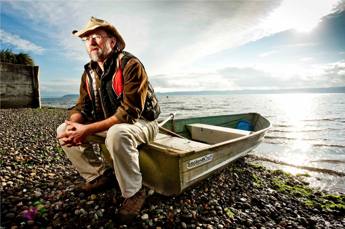
I picked this photo because the man is staring out of frame and makes me wonder what he's looking at. I also like the casual say he's sitting and thinking on the boat. The background is beautiful and creates a lot of depth. He's also in the third of the frame.
Photography Self Portrait

I chose this photo because I love the vulnerability and emotion in this photo. Her pain translates through the photograph. I also like the smoke coming out of her mouth because it shows a story.

I picked this photo because I thought it was interesting how he was holding the camera up like a gun. I thought it could symbolize that photography has taken over his life and he'd die without it, or it was a play on words with the word "shoot." I also like his emotion he has on his face.
Casual Portraits
I picked this photo because I thought it demonstrated the rule of framing very well. I also like how she's kind of like the light at the end of the tunnel. I think the way that the tunnel is dark makes the colors behind her pop more.

I picked this photo because I like how everything behind him is blurry, but he's in focus. It shows rule of thirds very well also. I like how he's in a public and realistic setting.
Portrait Assignment Plan
For my portrait assignment I plan on taking pictures of someone on my softball team. I want to take them at the softball fields. She would be wearing her uniform and would be at the pitchers mound. She would have a softball in her right hand and her glove in her left. She'd be facing the back, but her face would be tilted more to the front so the viewer can see it. She would be looking down at the softball in a casual way and she would be a little backlit. To make this photograph successful, I'd need to do it on a weekend so it wouldn't be too dark outside while we do the shoot.
Love and Loss Warm-Up
1. These photographs made me feel a lot of different emotions. The first few made me feel happy and giddy for the two. They made me smile to look at them. When she first had breast cancer in the beginning you can see the hope in her face, but you could also see the pain she felt. Her pain was translated through the photos. The more pictures I looked at, the sadder I felt. I wanted her to make it through so badly for them. The last three pictures made me tear up a little bit. They made me feel really sad.
2. I totally agree with the photographer's quote "These photographs do not define us, but they are us." I think that's true, especially these photos. The photographer said this to show how much those photos meant to him. Photographs have the ability to let other people see inside your life.
3. I think I would try to take photos like this if I were in that situation. I would probably be very upset while taking the photos though. I would feel guilty that I was spending our time together with a camera. I'd want to be able to enjoy those last few moments together. At the same time, I'd want to take the photos to be able to have that connection forever.
4. If I could write Angelo a letter, I'd tell him that his photographs are outstanding. The way he was able to portray their emotions through the lens is amazing. I'd also tell him that I'm so so sorry for his loss and to stay strong. Losing someone is a tough thing to deal with, but at least he has those photographs to look at when he gets sad. She'll be with him forever now.
Tuesday, November 3, 2015
Rules of Photography Part Two
Theme : Cats, of course

Rule of Thirds

Balancing Elements

Leading Lines

Symmetry and Patterns (Repetition)

Viewpoint

Background

Create Depth

Framing

Cropping

Mergers and Avoiding Them
Wednesday, October 28, 2015
Africa and Abandoned Theme Parks
Africa
1. I'm a big fan of Nick Brandt's work. I think his photography is beautiful, and I admire his patience to get the photos he wants. As I was reading his interview with ScientificAmerican.com, I found myself getting emotional. I agree with his views on Africa's wildlife, and how he's fascinated and obsessed with these animals. I think it's very upsetting that so many of these amazing animals are getting killed for people's own benefits.

3. This photo by Nick Brandt is a line of elephants walking together. This is my favorite photo by Brandt because it has a sense of family to it. The elephants are walking united, and it shows love. I also love the beauty of the elephants, and how he was able to capture it.
4. In this photo, Nick Brandt used leading lines and the rule of thirds. Leading lines is where you have a line throughout the photo leading up to your main subject. The rule of thirds is when your main subject, the elephant in the front, is off centered and in a third of the frame.
5. Nick Brandt uses a Pentax 67II without a telephoto or zoom lens. This is important to his photography because it means that he's getting close up to the animals in order to capture their emotions. Also, this way he can get more of the setting into his photos.
6. Nick Brandt's reason to take these photos of African wildlife are to memorialize the vanishing beauty of these animals. He wants to show people how amazing these animals really are before it's too late.
7. Nick Brandt takes these photos in hope that people will realize how great these animals are. He hopes that people will reach out and help the wildlife before it's too late. Brandt wants to encourage people to help and donate to charities to keep these animals alive.
8. "My images are unashamedly idyllic and romantic, a kind of enchanted Africa. They're my elegy to a world that is steadily, tragically vanishing." - Nick Brandt
Abandoned Theme Parks
1. I would like to visit the Six Flags, in New Orleans. I want to go to this theme park because it seems like it has a lot of things from the park have been kept in good condition. There's still a lot of the figures and rides in tact, and I think I could take a lot of creepy photos there.

3. The Myrtles Plantation, Louisiana; Highgate Cemetery, London; Convent of Saint Agnes, Prague; Saint Augustine Lighthouse, Florida; Eastern State Penitentiary, Philadelphia

Highgate Cemetery, London
5. I would be interested in taking photos at the Highgate Cemetery in London because cemeteries often creep people out. I think the uncomfortable feeling of cemeteries is what draws me to this location. I want to be able to capture the chilling sights of this cemetery. I would want people to see my photos and get uneasy about the setting of them. I'd expect to take a lot of backlit photos, like the one posted above, for a more dramatic photo.
6. If I were to actually go to this location to take photos, I would need some things. One would be better camera equipment with a tripod and multiple different lenses. My travel plan would probably be to fly to London, stay with my friend and her family who live there for a week, and go to the Highgate Cemetery everyday. In order to get the best photos I'm capable of, I'd go multiple days for long hours. I don't think I'd have to worry about many laws besides trespassing, I would just be worried to disturb other people and disrespect the loved ones of the people who have passed.
Monday, October 26, 2015
Funny Captions

Watching his 87th birthday cake burn, Urkle Harrington reminisces about his days in the war. Harrington served in the military for 2 weeks, but he then returned home to catch up on his soap operas.

Dancing with his mini clones in the middle of an outlet mall, Barney Levee jams to the latest One Direction single. Levee choreographed a dance and taught it to all of his slaves.

Getting hyped for the upcoming baseball game, Alina Wallace shows off her newly styled hair. Wallace bleached her hair when she realized that she meant to dye the MLB logo instead of the NFL logo.
Friday, October 16, 2015
Great Black and White Photographers Part 3


1. What caught my eye with Roy DeCarava's photos was the emotion he was able to portray in these photos. You can tell that his subjects have a story, and he was able to deliver that story. I've always been interested in the time period of segregation, and the struggle people went through to be treated as equals. DeCarava shot during this time to inspire others to continue fighting. He wanted to show determination in his photos, and I think he achieved that.
2. In the first photo, I see the look of determination in everyone's eyes. I see how happy I could be in the future if everyone would just treat us equally. I see the struggle that we've all gone through to be treated like humans. I smell the sweat of everyone around me as the sun beats down on our shoulders. I smell the freshly cut grass while we march through the city. I hear people chanting for freedom around us. I hear the sirens of the police approaching and the orders from the policemen to stop. I hear the inspiring words to keep going in my head. I can almost taste the victory that is sure to come. I taste the blood in my mouth as I bite my tongue to not say anything to the policemen. I feel the bodies of my fellow marchers around me. I feel the glares and hatred of the white people as we walk by them. I feel like I want to give up, but I continue moving my feet towards our goal. I feel like I'm changing the course of history.
In the second photo, I see the downfall of my business. I see the unsold bottles of Pepsi around me. I smell the smoke around me as people light their freshly bought cigarettes. I smell the gas leave the cars as they drive by. I smell the pastries being made down the street. I hear the honking cars as they try to make their way down the road. I hear people's footsteps walk by without a second glance. I hear the people ridiculing me and my failed success. I taste my sweat mixing with my tears as they drip down my face. I taste the unwanted pepsis. I feel my eyelids become heavy with sleep as I fight to stay awake. I feel my muscles begin to give out as I lift yet another full crate of bottles. I feel like I'm no longer a human like everyone around me has told me.
3. If I were to create something to show other people Roy DeCarava's work, I'd want it to be something that a lot of people have access to and would actually check. I like the ideas of a poster or powerpoint, but people wouldn't be able to show people who don't go to Bowie his photography. I like the idea of doing something on social media. A blog would be nice or maybe even an Instagram account. If I did a blog I'd be able to express my thoughts toward his work and if I did an Instagram account I could do the same thing, but I could also have people who would check it regularly. If it's possible, I'd like to create an Instagram account for Roy DeCarava, if not, I'd like to make a blog dedicated to him and his photos.
Mural Project
1. I can think of a few different themes that I think would be very interesting to do at Bowie. One theme could be "Bowie Pride," we'd put pictures of people at sports games, people at pep rallies and people on the themed days like Pink Out or Hawaiian Day. Another theme could be "Stand Up Bowie." Since this is such a big thing this year at Bowie, I think this would be a good mural to make. It would be pictures of people with their friends and helping out the community. I think these murals would be very beautiful for Bowie.
2. I think we should let people use regular cameras if they don't have camera phones. One point of the mural is to unite people together who aren't usually with each other. If we exclude a group of people, then we aren't uniting Bowie students like we should.
3. I think we should put the mural either in the foyer of the L hall by the kennel, or by the library. We should put the mural somewhere that's a popular spot so it'll get seen by a lot of people. We should also put the mural inside somewhere so that it won't get ruined by weather.
Thursday, October 8, 2015
Academic Shoot Reflection and Critique
Reflection
1. A challenge I faced while going on this shoot was to not disrupt the class while I was taking photos. I didn't want the teacher to be upset that I was in there, so I had to be as quiet as possible. Another challenge was trying to get photos of students who weren't posing. I wanted to get candid shots, and I had a few encounters with people who would pose as soon as I pointed the camera their direction.
2. I found myself thinking a lot about keeping my subject in focus. For example in the picture of the leading lines with the students working in desks, I wanted to have the girl in the front desk in focus. Since she wasn't in the middle of the frame, the camera would automatically put her out of focus while I was trying to take the photo.
3. If I could do this shoot again I'd try to incorporate more composition rules into my photos. I was able to get at least one in every photo I took, but I want to challenge myself to achieve more than one next time.
4. If I were to redo this shoot, I'd want to go to the same locations. I was able to take a lot of good pictures in these spots and I really liked the different angles I could get in them.
5. I think the easiest rule to achieve is either leading lines or rule of thirds. These rules have to do with how you position yourself and has nothing to do with your subject doing anything. You can get rule of thirds in almost every photo you ever take if you wanted to.
6. I think the hardest rule to capture is framing because with this rule you have to have the right location to make this rule happen. It has little to do with how you position yourself and more to do with the location of your subject.
7. The rule I'm still a little confused on is avoiding mergers because I don't know what is okay to cut off. To get more clear on this photo, I can go back to the composition rules website and read about that rule again. I could also go to google and look up merger photos and see what the photographer did incorrectly.
Critique
I really liked the different angles that Leslie was able to achieve while taking these photos. There's a lot of variety and I really like that. I really like the third picture she took and put in black and white. I love how it's dramatic and the black and white filter fits this photo perfectly. I think that her photos are a little overexposed, so maybe in photoshop she could try darkening her levels a little bit more.
Academic Shoot

1. In this photo I used the composition rule of balance. This photo follows this rule because the boy sitting down and the woman standing up balance each other out.
2. The subject of this photo is both the boy sitting on the left and the woman standing on the right.
3. I think it's clear to the people looking at this photo who the subjects are because they're in the center, they're in focus, and they're the biggest things in the photo.
4. If you couldn't clearly tell what the subjects were, I could have moved to angle myself so that the table was not in the photo at all.

1. In this photo I used the rule of simplicity because the flag is in focus with a simple background of the ceiling.
2. The subject of this photo is the American Flag in the center of the photo.
3. I think the subject of this photo is very clear because it's the only thing in the photo except the ceiling.
4. If the subject was not clear to someone in this photo, I could have found a different less busy background.

1. In this photo I used the rule of leading lines because the students in the desks create a line going to the back of the photo.
2. The subject of this photo is mainly the girl in the front desk on the left.
3. I think the subject of this photo could be a little unclear because it's such a busy photo.
4. To make the subject more clear in this photo, I could have found a row of desks that wasn't as busy and didn't have the teacher in the background.
Friday, October 2, 2015
DSLR Camera Simulator
Possible Aperture Settings
- 2.8
- 4
- 5.6
- 8
- 11
- 16
- 22
Possible Shutter Speed Settings
- 1
- 1/60
- 1/4000
Possible ISO Settings
- 100
- 200
- 400
- 800
- 1600
- 3200
- 6400
- 12800
- 25600
ISO

ISO 200

ISO 6400
1. The advantages of using a high ISO during a sports game or at night is because it'll let more light into the photo and it'll help stop the motion to get a good action shot.
2. The author suggests using the lowest ISO whenever possible. This way you get most of the details in the photo and it's very clear.
3. The author suggests using a higher ISO when there isn't enough light to quickly take an action shot. He says it's okay to use a higher ISO when you want to stop the motion, but you need to ask yourself if the noise that comes long with it is acceptable.
Shutter Speed

Fast Shutter Speed

Slow Shutter Speed
1. If I was assigned to Bulldogs and Hotdogs and it was in the morning when there was lots of light I would...
a.) I would set the shutter speed at a relatively slow speed. Since there isn't a lot of action going on and there's good lighting I wouldn't need to use a fast shutter speed.
f.) I would set the shutter speed at a faster speed. There's action in the picture, and I'd rather capture the moment than show motion.
If it was night and there wasn't as good lighting I would...
c.) I would set the shutter speed at a faster speed. When the dancers are dancing you want to be able to see their moves without blur.
d.) I would set the shutter speed in the middle, not too fast and not too slow. The lighting isn't as good, so you can't have a really fast shutter speed because then it would be too dark. You don't want a slow shutter speed for this either because then the students dancing would be blurry.
2. The three modes a camera has regarding shutter speed are "Aperture Priority," "Shutter Priority" and "Manual." In "Aperture Priority" mode, the photographer sets the aperture and the camera automatically sets the shutter speed. In "Shutter Priority" mode, the photographer sets the shutter speed and the camera automatically sets the aperture. In "Manual," the photographer is in control of all the settings and can change them however they want to.
Aperture

F2.8 Aperture

F16 Aperture
1. Many people closely relate aperture to the human eye. The aperture and human eye both determine how much light passes through.
2. The smaller the aperture the larger the f-stop, the higher the aperture the smaller the f-stop.
3. Aperture greatly impacts the depth of field of a picture. Depth of field is how blurry the background of your object is. If you want your subject to stand out from the background, you'd use a smaller aperture.
Wednesday, September 30, 2015
Unusual and Interesting Photos
Part One

1. I wasn't a huge fan of Christian Rhum's photos. I liked his creativity and his new ideas, but I didn't like the "wobbly" images. I think the impact the buildings have was lost. You couldn't see the details of the buildings, and I think it would have had more impact if you would have just shot them at an angle using simplicity.
2. I think he used a long exposure to take these photos. He slowed down the shutter speed and slowly moved the camera while it was taking the picture of the building. He either did this, or he developed the different pictures on top of each other to achieve the effect he was looking for.
3. I would like to try to take a picture like this on the Empire State building in New York. Since it's in New York though, I don't have access to take that picture. A place that I'd have a better chance of being able to shoot would be the UT Tower or the Austin Capital downtown.
Part Three
1. I think the three most important things photographers should remember when shooting are to take a picture that shows perspective, story telling through facial expressions and to never stop looking for the right angle.

"Hand with reflecting sphere" M.C. Escher

4. I believe the photographer followed all of the suggestions. The photographer took a photo of a reflection, himself and it shows perspective. The only thing that he didn't do was take a photo of his hand, instead he took it of his feet.
5. The two most influencing pictures to me are "Nighthawks" by Edward Hopper and "Poppy" by Georgia O'Keeffe. I like how Edward Hopper's showed the quiet moments instead of the hectic action shots. I think that's something I could incorporate into my photography. I also liked how Georgia O'Keeffe showed a close up of the flower. She filled the frame with the flower without crowding the image. This is also something I will begin to think about when I take photos.
Subscribe to:
Comments (Atom)