Wednesday, October 28, 2015

Africa and Abandoned Theme Parks

Africa

1. I'm a big fan of Nick Brandt's work. I think his photography is beautiful, and I admire his patience to get the photos he wants. As I was reading his interview with ScientificAmerican.com, I found myself getting emotional. I agree with his views on Africa's wildlife, and how he's fascinated and obsessed with these animals. I think it's very upsetting that so many of these amazing animals are getting killed for people's own benefits. 


3. This photo by Nick Brandt is a line of elephants walking together. This is my favorite photo by Brandt because it has a sense of family to it. The elephants are walking united, and it shows love. I also love the beauty of the elephants, and how he was able to capture it.

4. In this photo, Nick Brandt used leading lines and the rule of thirds. Leading lines is where you have a line throughout the photo leading up to your main subject. The rule of thirds is when your main subject, the elephant in the front, is off centered and in a  third of the frame.

5. Nick Brandt uses a Pentax 67II without a telephoto or zoom lens. This is important to his photography because it means that he's getting close up to the animals in order to capture their emotions. Also, this way he can get more of the setting into his photos.

6. Nick Brandt's reason to take these photos of African wildlife are to memorialize the vanishing beauty of these animals. He wants to show people how amazing these animals really are before it's too late.

7. Nick Brandt takes these photos in hope that people will realize how great these animals are. He hopes that people will reach out and help the wildlife before it's too late. Brandt wants to encourage people to help and donate to charities to keep these animals alive.

8. "My images are unashamedly idyllic and romantic, a kind of enchanted Africa. They're my elegy to a world that is steadily, tragically vanishing." - Nick Brandt

Abandoned Theme Parks

1. I would like to visit the Six Flags, in New Orleans. I want to go to this theme park because it seems like it has a lot of things from the park have been kept in good condition. There's still a lot of the figures and rides in tact, and I think I could take a lot of creepy photos there. 


3. The Myrtles Plantation, Louisiana; Highgate Cemetery, London; Convent of Saint Agnes, Prague; Saint Augustine Lighthouse, Florida; Eastern State Penitentiary, Philadelphia

Highgate Cemetery, London

5. I would be interested in taking photos at the Highgate Cemetery in London because cemeteries often creep people out. I think the uncomfortable feeling of cemeteries is what draws me to this location. I want to be able to capture the chilling sights of this cemetery. I would want people to see my photos and get uneasy about the setting of them. I'd expect to take a lot of backlit photos, like the one posted above, for a more dramatic photo. 

6. If I were to actually go to this location to take photos, I would need some things. One would be better camera equipment with a tripod and multiple different lenses. My travel plan would probably be to fly to London, stay with my friend and her family who live there for a week, and go to the Highgate Cemetery everyday. In order to get the best photos I'm capable of, I'd go multiple days for long hours. I don't think I'd have to worry about many laws besides trespassing, I would just be worried to disturb other people and disrespect the loved ones of the people who have passed. 


Monday, October 26, 2015

Funny Captions


Watching his 87th birthday cake burn, Urkle Harrington reminisces about his days in the war. Harrington served in the military for 2 weeks, but he then returned home to catch up on his soap operas. 


Dancing with his mini clones in the middle of an outlet mall, Barney Levee jams to the latest One Direction single. Levee choreographed a dance and taught it to all of his slaves. 


Getting hyped for the upcoming baseball game, Alina Wallace shows off her newly styled hair. Wallace bleached her hair when she realized that she meant to dye the MLB logo instead of the NFL logo.

Friday, October 16, 2015

Great Black and White Photographers Part 3


1. What caught my eye with Roy DeCarava's photos was the emotion he was able to portray in these photos. You can tell that his subjects have a story, and he was able to deliver that story. I've always been interested in the time period of segregation, and the struggle people went through to be treated as equals. DeCarava shot during this time to inspire others to continue fighting. He wanted to show determination in his photos, and I think he achieved that. 

2. In the first photo, I see the look of determination in everyone's eyes. I see how happy I could be in the future if everyone would just treat us equally. I see the struggle that we've all gone through to be treated like humans. I smell the sweat of everyone around me as the sun beats down on our shoulders. I smell the freshly cut grass while we march through the city. I hear people chanting for freedom around us. I hear the sirens of the police approaching and the orders from the policemen to stop. I hear the inspiring words to keep going in my head. I can almost taste the victory that is sure to come. I taste the blood in my mouth as I bite my tongue to not say anything to the policemen. I feel the bodies of my fellow marchers around me. I feel the glares and hatred of the white people as we walk by them. I feel like I want to give up, but I continue moving my feet towards our goal. I feel like I'm changing the course of history.

   In the second photo, I see the downfall of my business. I see the unsold bottles of Pepsi around me. I smell the smoke around me as people light their freshly bought cigarettes. I smell the gas leave the cars as they drive by. I smell the pastries being made down the street. I hear the honking cars as they try to make their way down the road. I hear people's footsteps walk by without a second glance. I hear the people ridiculing me and my failed success. I taste my sweat mixing with my tears as they drip down my face. I taste the unwanted pepsis. I feel my eyelids become heavy with sleep as I fight to stay awake. I feel my muscles begin to give out as I lift yet another full crate of bottles. I feel like I'm no longer a human like everyone around me has told me.

3. If I were to create something to show other people Roy DeCarava's work, I'd want it to be something that a lot of people have access to and would actually check. I like the ideas of a poster or powerpoint, but people wouldn't be able to show people who don't go to Bowie his photography. I like the idea of doing something on social media. A blog would be nice or maybe even an Instagram account. If I did a blog I'd be able to express my thoughts toward his work and if I did an Instagram account I could do the same thing, but I could also have people who would check it regularly. If it's possible, I'd like to create an Instagram account for Roy DeCarava, if not, I'd like to make a blog dedicated to him and his photos. 

Mural Project

1. I can think of a few different themes that I think would be very interesting to do at Bowie. One theme could be "Bowie Pride," we'd put pictures of people at sports games, people at pep rallies and people on the themed days like Pink Out or Hawaiian Day. Another theme could be "Stand Up Bowie." Since this is such a big thing this year at Bowie, I think this would be a good mural to make. It would be pictures of people with their friends and helping out the community. I think these murals would be very beautiful for Bowie.


2. I think we should let people use regular cameras if they don't have camera phones. One point of the mural is to unite people together who aren't usually with each other. If we exclude a group of people, then we aren't uniting Bowie students like we should.


3. I think we should put the mural either in the foyer of the L hall by the kennel, or by the library. We should put the mural somewhere that's a popular spot so it'll get seen by a lot of people. We should also put the mural inside somewhere so that it won't get ruined by weather. 

Thursday, October 8, 2015

Academic Shoot Reflection and Critique

Reflection

1. A challenge I faced while going on this shoot was to not disrupt the class while I was taking photos. I didn't want the teacher to be upset that I was in there, so I had to be as quiet as possible. Another challenge was trying to get photos of students who weren't posing. I wanted to get candid shots, and I had a few encounters with people who would pose as soon as I pointed the camera their direction.

2. I found myself thinking a lot about keeping my subject in focus. For example in the picture of the leading lines with the students working in desks, I wanted to have the girl in the front desk in focus. Since she wasn't in the middle of the frame, the camera would automatically put her out of focus while I was trying to take the photo.

3. If I could do this shoot again I'd try to incorporate more composition rules into my photos. I was able to get at least one in every photo I took, but I want to challenge myself to achieve more than one next time. 

4. If I were to redo this shoot, I'd want to go to the same locations. I was able to take a lot of good pictures in these spots and I really liked the different angles I could get in them.

5. I think the easiest rule to achieve is either leading lines or rule of thirds. These rules have to do with how you position yourself and has nothing to do with your subject doing anything. You can get rule of thirds in almost every photo you ever take if you wanted to.

6. I think the hardest rule to capture is framing because with this rule you have to have the right location to make this rule happen. It has little to do with how you position yourself and more to do with the location of your subject.

7. The rule I'm still a little confused on is avoiding mergers because I don't know what is okay to cut off. To get more clear on this photo, I can go back to the composition rules website and read about that rule again. I could also go to google and look up merger photos and see what the photographer did incorrectly.

Critique


I really liked the different angles that Leslie was able to achieve while taking these photos. There's a lot of variety and I really like that. I really like the third picture she took and put in black and white. I love how it's dramatic and the black and white filter fits this photo perfectly. I think that her photos are a little overexposed, so maybe in photoshop she could try darkening her levels a little bit more.

Academic Shoot


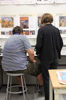
1. In this photo I used the composition rule of balance. This photo follows this rule because the boy sitting down and the woman standing up balance each other out.

2. The subject of this photo is both the boy sitting on the left and the woman standing on the right.

3. I think it's clear to the people looking at this photo who the subjects are because they're in the center, they're in focus, and they're the biggest things in the photo.

4. If you couldn't clearly tell what the subjects were, I could have moved to angle myself so that the table was not in the photo at all.


1. In this photo I used the rule of simplicity because the flag is in focus with a simple background of the ceiling.

2. The subject of this photo is the American Flag in the center of the photo.

3. I think the subject of this photo is very clear because it's the only thing in the photo except the ceiling.

4. If the subject was not clear to someone in this photo, I could have found a different less busy background.


1. In this photo I used the rule of leading lines because the students in the desks create a line going to the back of the photo.

2. The subject of this photo is mainly the girl in the front desk on the left.

3. I think the subject of this photo could be a little unclear because it's such a busy photo.

4. To make the subject more clear in this photo, I could have found a row of desks that wasn't as busy and didn't have the teacher in the background.

Friday, October 2, 2015

DSLR Camera Simulator

Possible Aperture Settings
  • 2.8
  • 4
  • 5.6
  • 8
  • 11
  • 16
  • 22

Possible Shutter Speed Settings

  • 1
  • 1/60
  • 1/4000
Possible ISO Settings

  • 100
  • 200
  • 400
  • 800
  • 1600
  • 3200
  • 6400
  • 12800
  • 25600

ISO

ISO 200

ISO 6400

1. The advantages of using a high ISO during a sports game or at night is because it'll let  more light into the photo and it'll help stop the motion to get a good action shot.

2. The author suggests using the lowest ISO whenever possible. This way you get most of the details in the photo and it's very clear. 

3. The author suggests using a higher ISO when there isn't enough light to quickly take an action shot. He says it's okay to use a higher ISO when you want to stop the motion, but you need to ask yourself if the noise that comes long with it is acceptable. 

Shutter Speed

Fast Shutter Speed

Slow Shutter Speed

1. If I was assigned to Bulldogs and Hotdogs and it was in the morning when there was lots of light I would...

a.) I would set the shutter speed at a relatively slow speed. Since there isn't a lot of action going on and there's good lighting I wouldn't need to use a fast shutter speed.

f.) I would set the shutter speed at a faster speed. There's action in the picture, and I'd rather capture the moment than show motion. 

If it was night and there wasn't as good lighting I would...

c.) I would set the shutter speed at a faster speed. When the dancers are dancing you want to be able to see their moves without blur. 

d.) I would set the shutter speed in the middle, not too fast and not too slow. The lighting isn't as good, so you can't have a really fast shutter speed because then it would be too dark. You don't want a slow shutter speed for this either because then the students dancing would be blurry.

2. The three modes a camera has regarding shutter speed are "Aperture Priority," "Shutter Priority" and "Manual." In "Aperture Priority" mode, the photographer sets the aperture and the camera automatically sets the shutter speed. In "Shutter Priority" mode, the photographer sets the shutter speed and the camera automatically sets the aperture. In "Manual," the photographer is in control of all the settings and can change them however they want to.

Aperture

F2.8 Aperture

F16 Aperture


1. Many people closely relate aperture to the human eye. The aperture and human eye both determine how much light passes through. 

2. The smaller the aperture the larger the f-stop, the higher the aperture the smaller the f-stop. 

3. Aperture greatly impacts the depth of field of a picture. Depth of field is how blurry the background of your object is. If you want your subject to stand out from the background, you'd use a smaller aperture.