This is my "Square" photo. For this photo, I used the rule of thirds and lines techniques. I used the rule of thirds by placing the actual square in the top left corner instead of centering it. I used lines by using the wooden support beams to have them lead up to the window.
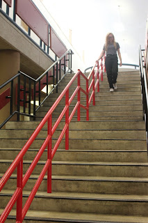
This is my "Happy" photo. In the photo, I used the lines technique. I used the railings on the stairs to lead up to the main subject that's happily walking down the stairs.
This is my "Bowie" photo. I used the framing technique to make this picture more dynamic. I used the railings on the second floor to frame the main subjects on the first floor.
This is my "Metal" photo. In this picture I tried to use lines, the rule of thirds and simplicity. I only ended up achieving simplicity and lines because the fence isn't really in a third of the frame. It shows simplicity because the subject is the only thing in the photo with a very blank background. This photo also shows lines because the rails on the metal fence create lines throughout the frame.
This is my "Merger" photo. It shows a merger because the girl on the very left is cut off. Almost her entire body is cut off. I also was able to use the rule of thirds in this picture because the subjects are in the left third of the frame. This picture also shows framing because the bush in the bottom right and the tree at the top frames the subjects.


No comments:
Post a Comment