Wednesday, September 30, 2015

Unusual and Interesting Photos

Part One


1. I wasn't a huge fan of Christian Rhum's photos.  I liked his creativity and his new ideas, but I didn't like the "wobbly" images. I think the impact the buildings have was lost. You couldn't see the details of the buildings, and I think it would have had more impact if you would have just shot them at an angle using simplicity.

2. I think he used a long exposure to take these photos. He slowed down the shutter speed and slowly moved the camera while it was taking the picture of the building. He either did this, or he developed the different pictures on top of each other to achieve the effect he was looking for.

3. I would like to try to take a picture like this on the Empire State building in New York. Since it's in New York though, I don't have access to take that picture. A place that I'd have a better chance of being able to shoot would be the UT Tower or the Austin Capital downtown. 

Part Three

1. I think the three most important things photographers should remember when shooting are to take a picture that shows perspective, story telling through facial expressions and to never stop looking for the right angle. 

"Hand with reflecting sphere" M.C. Escher


4. I believe the photographer followed all of the suggestions. The photographer took a photo of a reflection, himself and it shows perspective. The only thing that he didn't do was take a photo of his hand, instead he took it of his feet.

5. The two most influencing pictures to me are "Nighthawks" by Edward Hopper and "Poppy" by Georgia O'Keeffe. I like how Edward Hopper's showed the quiet moments instead of the hectic action shots. I think that's something I could incorporate into my photography. I also liked how Georgia O'Keeffe showed a close up of the flower. She filled the frame with the flower without crowding the image. This is also something I will begin to think about when I take photos.

Thursday, September 24, 2015

Academic Shoot Preview

"The Story"

   I think this photo has the best story behind it. The story that I get from this photo is that the students are helping out and giving back by serving less fortunate people. They're being generous by spending their time helping others. The people receiving the food seem very grateful.

"Action and Emotion"

   I think this photo shows the best emotion. Almost all of the students have a smile on their face. It looks like they are amazed by the experiment they've completed. They seem like they're having a fun time.

"Filling the Frame"

   I think this photo fills the frame with something interesting the most out of all the other pictures. The frame is being filled by both the students and the project they're working on. The smoke on the bottom helps fill the frame as well.


Part Two

   The picture I liked the most was the first one of the boy in science class doing an experiment. I picked this picture because it shows his emotion while performing the experiment. Also because it's a very interesting photo to me. The photographer was able to make a very simple thing, like pouring chemicals into a solution, into a beautiful photo. A rule of composition the photographer used was balance. The photo is equally balanced with the two beakers in his hands. Another rule evident in this photo is lines. The photo creates lines with the chemicals pouring out of the beakers. Also the beakers themselves make a horizontal line across the photo.


Part Three

   I think I could take pictures like these in classes like orchestra, science and yearbook  depending on what they're doing that day. I hope to be able to visit Mr. Chisum in orchestra, Mr. Mayfield in science and Ms. Dellana for yearbook. As a photographer, I would look for ways that I could apply the rules of composition into the photo. In orchestra, I would try to get lines by using the strings of the instrument to lead up to the musician. I would try to get simplicity in science by standing higher up and taking a picture looking down at a student against the black tables. In yearbook, I'd like to try to use framing with the computers or lines as well with the computers. To achieve those rules I'd stand on the side of the table and shoot the people working with the computers creating a line. For framing, I would stand in front of the table and shoot through the computers.

Tuesday, September 22, 2015

Photo Manipulation and Ethics

   Photographers often alter their photos a number of reasons. Some alter them to make them more impactful and others to remove certain people. Many people look down upon photoshopping photos because they say it makes the photos unethical. If a photographer is caught altering their photos, they can get their photos taken off newspapers, articles, etc. and they can ruin their career.
   I think this type of photoshopping is unethical. A photographer's goal is to take a photo to share a story. I think it's their job to tell the story correctly and not apply their personal opinions into it. For example, the person who edited the women out of the picture of the members of the Netanyahu's new government put their own thoughts and ideas to manipulate the picture, and I think that's wrong.

   I think this photo was the most unethical because it's indirectly body shaming Oprah. The person who manipulated this picture was practically saying that Oprah's body wasn't good enough. It's sending a message to all the young girls that you need to be skinny to be beautiful.


   I think this photo is the least unethical because all they did was move the pyramids closer to be able to showcase its full beauty. I believe that the person who altered the photo had good intentions because he/she just wanted to be able to show all of the pyramids. All of the other photos manipulated a person's physical body or appearance, and this one just moved the pyramids closer to each other.


Friday, September 18, 2015

Great Black and White Photographers Part 2

   Roy DeCarava was born on December 9, 1919 in Harlem, New York City, New York. DeCarava was educated in the city's public schools, and he studied painting, architecture and sculpting at the Cooper Union Institute in New York from 1938-1940. Later on he enrolled at the Harlem Art Center and the George Washington Carver Art School. 
   DeCarava began his career as a painter and switched to photography to gather more information for his paintings. He did many solo exhibitions and participated in some group exhibitions as well. He published five books including The Sound I Saw and The Sweet Flypaper of Life. DeCarava was the first African American to win the Guggenheim Fellowship and he was awarded the National Medal of Arts which is the highest award given to artists by the United States Government. 
   Roy DeCarava died on October 27, 2009 at the age of 89. 


"Mississippi freedom marcher, Washington D.C."
1963

"Pepsi"
1964


Wednesday, September 16, 2015

Post Shoot Reflection

1. A challenge I faced while taking these photos was that I wanted to be creative with my photos and not use the obvious areas of the school. I found that a little hard because I'd find a good square, but I felt like other people would have found that same example and used it. I wanted to think outside of the box. 

2. While taking these pictures, I thought a lot about the rules of composition. I wanted each of my pictures to showcase a different technique. One that I thought a lot about was my "Bowie" photo. I wanted to use the railing as framing, but I didn't want to distract away from the subject. To solve this problem I just focused the camera on the students working and zoomed in so the railing wasn't in the picture too much.

3. If I were to do this photo shoot again, I would try to improve my "Metal" photo. I would want to make the line of the fence a little more angled and not so flat. To do this, I would stand a little bit more to the left and angle the camera to get more of a diagonal line.

4. If I were to do this photo shoot again, I'd probably keep my "Happy" and "Square" photo the same. I liked how I had the lines leading to the main subject of my photo. I'd also probably keep the general idea of every photo I had and what technique I would use for that picture.

6. I wouldn't be interested in shooting these same prompts again because I would already know what to shoot. For every prompt, I had at least two or more other places and examples I could use for it. I like a challenge, so I would like to have a new prompt that I wouldn't be able to prepare ideas for beforehand.


Part Two


On Timmy's blog, I really liked his "Happy" and "Metal" photos. I liked how his "Happy" photo made me feel happy and I could feel the emotion in the photo. I also liked how his "Metal" photo used the lines of the Kennel to lead up to his subject. 

One thing I think he could improve on is trying to incorporate more techniques into his photos. 

Prompt Shoot 1

 This is my "Square" photo. For this photo, I used the rule of thirds and lines techniques. I used the rule of thirds by placing the actual square in the top left corner instead of centering it. I used lines by using the wooden support beams to have them lead up to the window.

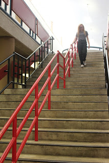
This is my "Happy" photo. In the photo, I used the lines technique. I used the railings on the stairs to lead up to the main subject that's happily walking down the stairs. 

This is my "Bowie" photo. I used the framing technique to make this picture more dynamic. I used the railings on the second floor to frame the main subjects on the first floor.

This is my "Metal" photo. In this picture I tried to use lines, the rule of thirds and simplicity. I only ended up achieving simplicity and lines because the fence isn't really in a third of the frame. It shows simplicity because the subject is the only thing in the photo with a very blank background. This photo also shows lines because the rails on the metal fence create lines throughout the frame.

This is my "Merger" photo. It shows a merger because the girl on the very left is cut off. Almost her entire body is cut off. I also was able to use the rule of thirds in this picture because the subjects are in the left third of the frame. This picture also shows framing because the bush in the bottom right and the tree at the top frames the subjects.

Thursday, September 10, 2015

Avoiding Mergers


This is a picture where the photographer didn't avoid mergers. The photographer cut off the man's head and hand. It also cuts off the man in the background on the right. Mergers are bad because it doesn't show the full effect the picture had the capability of having. Now instead of focusing on the woman, my eye goes to the man's head.

Framing


This photo shows framing because the broken wall creates a frame around the firefighter. This technique makes the photo more dramatic because it shows the heroic firefighter in the midst of the damage. It makes you focus on him, and it shows him as a light in the darkness.

Balance


This is a good picture because the men are balancing out the photo. There's an even amount of people on both sides. Balance is a good technique because it makes it easier for your eye to look at the picture, it's more pleasing to the eye.

Lines


This photo has many lines in it. The windows make lines, the side of the building makes lines, and even the smoke creates horizontal lines. Lines is a good technique because they usually lead you to the main subject of the photo. They make it obvious who or what your subject is.


The Rule of Thirds


The rule of thirds is a great photo technique. This is where you position your subject to a third of the frame instead of the center. It makes the photo more appealing to your eye. This photo used the rule of thirds to show the damage of the tragedy and the heroes that helped save lives that day.

Simplicity


This photo shows simplicity. It represents this technique because the subject of the photo, the tower, is the main focus and the background is simple and blank, the smoke and debris. This is a good technique to use because it makes it obvious who or what your subject is without making the background busy and distracting.

Thursday, September 3, 2015

The Camera


The Camera

1. The "obscura effect," or "dark room" in Latin, is how Greek and Chinese philosophers discovered how to work a camera. If you go to a dark room and focus light into a small hole in the wall, the image is projected onto the opposite wall upside down. It works because the small hole acted like a camera lens by focusing and showing the light on the wall.

2. In the 17th century, Isaac Newton and Christian Huygens became closer to understanding a camera by being able to make a high quality glass lens. 

3. In the 19th century, a man named Joseph Nicéphore Niépce added film to take the first photograph that took over 8 hours to expose. At this time, the camera consisted of a glass lens, a dark box, and film.

4. The modern camera is still a lot like the first ones our ancestors used. A camera still works by having light go through the lens and expose the film. Plus, in the end you still end up with a photograph.

5. At the same time, the modern camera is different from the first ones. Photographers no longer use plastic film. Instead, they use digital film. Now the photographs get saved onto a reusable computer memory device and they get put onto an electronic sensor called a CCD. Modern photography is cheaper and more environmentally safe than it ever has been.

Camera Modes

6. Cameras have many modes, two of them being Automatic and Program. These two are pretty similar but have a few differences. When using Automatic mode, the photographer doesn't have any control over the settings. The camera will take care of everything, including control flash and exposure. The Program mode takes control of most things and allows the photographer to change the control flash and a few other camera settings.

7.  Another setting is the Portrait mode. This mode is used for taking pictures of one main focus and blurring out the background. To get this result, the camera will use the fastest available lens setting or aperture.

8. The Sports mode isn't just used for sports. This mode is used when trying to stop the action within a picture. The camera will set it to have the fastest shutter speed.

The Half Press

9. You should use a half press on the trigger button because it will help you with three things. It will give your camera a faster response time, give you more control over the focus of the picture, and it encourages better composition. To do a half press, you press on the trigger button halfway. When you're ready to take the picture, you press down the rest of the way.

Controlling Flash


10. This symbol is called the "Disabled Flash." It turns the flash off so you use natural light. You would use this setting when you want a more dramatic photo.


11. This symbol is called the "Auto-Flash." It's an automatic setting and the flash will go off whenever the camera thinks it needs more light. You would use this if you are just starting out on photography and aren't sure whether to use a flash or not.

Introduction to Exposure

12. If there is too much light, your photo will become overexposed and will be washed out.

13. On the other hand, if there isn't enough light, your photo will be underexposed and your picture will be too dark.

The Universal Stop

14. A "stop" is a term used to show a change in the brightness of light. For example, if you have one lightbulb and add another, the light will increase by one stop. If you take the second one away again, it will decrease by one stop. 

15. If you were to go to a planet with two suns instead of one, the light would increase by one stop.

16. If there were four suns instead of two, the light would increase by two stops.

Shutters and Aperture

17. A longer shutter speed will give your photos more light.

18. A shorter shutter speed will give your photos less light.

19. The aperture is an opening in the lens, much like a pupil in an eye. The aperture reduces the brightness of light as it passes through it.

20. To give your photograph more light, adjust the aperture to have a larger opening. To do this, change your aperture settings to, for example, f4 to f2.8 to make it brighter. The lower the number, the more light will be let through and the brighter your picture will be.


Tuesday, September 1, 2015

Great Black and White Photographers

Margaret Bourke-White
"Diversion Tunnels, Fort Peck Dam"

Walker Evans
"Couple at Coney Island, New York"

Roy DeCarava
"Graduation"

First Photos


    This is my "Something Living" picture. I liked this picture because I think it shows the beauty that we have all around Bowie's campus. I think this is a good picture because the flower is in focus while the plants behind it is blurry, and it gives the picture dimension. I picked this picture because the flower isn't exactly in the center so it follows the rules of thirds. I used the manual focus to make the picture turn out the way I wanted it to with the flower in focus and nothing else. 


   This is my "First Day of School" picture. I like this one because it shows the entrance to this new school, and it reminds me of the way I felt when I walked through the doors for the first time. I think this is a good picture because the design on the floor has leading lines. I picked this photo because right as I took this picture the boy walked by and stood facing the courtyard. It makes me think that he is ready to conquer Bowie. To take this picture, I got in the middle of the entrance and crouched down so I was eye level with the doors.

Picture of Teammate

Free Choice