Thursday, September 24, 2015

Academic Shoot Preview

"The Story"

   I think this photo has the best story behind it. The story that I get from this photo is that the students are helping out and giving back by serving less fortunate people. They're being generous by spending their time helping others. The people receiving the food seem very grateful.

"Action and Emotion"

   I think this photo shows the best emotion. Almost all of the students have a smile on their face. It looks like they are amazed by the experiment they've completed. They seem like they're having a fun time.

"Filling the Frame"

   I think this photo fills the frame with something interesting the most out of all the other pictures. The frame is being filled by both the students and the project they're working on. The smoke on the bottom helps fill the frame as well.


Part Two

   The picture I liked the most was the first one of the boy in science class doing an experiment. I picked this picture because it shows his emotion while performing the experiment. Also because it's a very interesting photo to me. The photographer was able to make a very simple thing, like pouring chemicals into a solution, into a beautiful photo. A rule of composition the photographer used was balance. The photo is equally balanced with the two beakers in his hands. Another rule evident in this photo is lines. The photo creates lines with the chemicals pouring out of the beakers. Also the beakers themselves make a horizontal line across the photo.


Part Three

   I think I could take pictures like these in classes like orchestra, science and yearbook  depending on what they're doing that day. I hope to be able to visit Mr. Chisum in orchestra, Mr. Mayfield in science and Ms. Dellana for yearbook. As a photographer, I would look for ways that I could apply the rules of composition into the photo. In orchestra, I would try to get lines by using the strings of the instrument to lead up to the musician. I would try to get simplicity in science by standing higher up and taking a picture looking down at a student against the black tables. In yearbook, I'd like to try to use framing with the computers or lines as well with the computers. To achieve those rules I'd stand on the side of the table and shoot the people working with the computers creating a line. For framing, I would stand in front of the table and shoot through the computers.

Tuesday, September 22, 2015

Photo Manipulation and Ethics

   Photographers often alter their photos a number of reasons. Some alter them to make them more impactful and others to remove certain people. Many people look down upon photoshopping photos because they say it makes the photos unethical. If a photographer is caught altering their photos, they can get their photos taken off newspapers, articles, etc. and they can ruin their career.
   I think this type of photoshopping is unethical. A photographer's goal is to take a photo to share a story. I think it's their job to tell the story correctly and not apply their personal opinions into it. For example, the person who edited the women out of the picture of the members of the Netanyahu's new government put their own thoughts and ideas to manipulate the picture, and I think that's wrong.

   I think this photo was the most unethical because it's indirectly body shaming Oprah. The person who manipulated this picture was practically saying that Oprah's body wasn't good enough. It's sending a message to all the young girls that you need to be skinny to be beautiful.


   I think this photo is the least unethical because all they did was move the pyramids closer to be able to showcase its full beauty. I believe that the person who altered the photo had good intentions because he/she just wanted to be able to show all of the pyramids. All of the other photos manipulated a person's physical body or appearance, and this one just moved the pyramids closer to each other.


Friday, September 18, 2015

Great Black and White Photographers Part 2

   Roy DeCarava was born on December 9, 1919 in Harlem, New York City, New York. DeCarava was educated in the city's public schools, and he studied painting, architecture and sculpting at the Cooper Union Institute in New York from 1938-1940. Later on he enrolled at the Harlem Art Center and the George Washington Carver Art School. 
   DeCarava began his career as a painter and switched to photography to gather more information for his paintings. He did many solo exhibitions and participated in some group exhibitions as well. He published five books including The Sound I Saw and The Sweet Flypaper of Life. DeCarava was the first African American to win the Guggenheim Fellowship and he was awarded the National Medal of Arts which is the highest award given to artists by the United States Government. 
   Roy DeCarava died on October 27, 2009 at the age of 89. 


"Mississippi freedom marcher, Washington D.C."
1963

"Pepsi"
1964


Wednesday, September 16, 2015

Post Shoot Reflection

1. A challenge I faced while taking these photos was that I wanted to be creative with my photos and not use the obvious areas of the school. I found that a little hard because I'd find a good square, but I felt like other people would have found that same example and used it. I wanted to think outside of the box. 

2. While taking these pictures, I thought a lot about the rules of composition. I wanted each of my pictures to showcase a different technique. One that I thought a lot about was my "Bowie" photo. I wanted to use the railing as framing, but I didn't want to distract away from the subject. To solve this problem I just focused the camera on the students working and zoomed in so the railing wasn't in the picture too much.

3. If I were to do this photo shoot again, I would try to improve my "Metal" photo. I would want to make the line of the fence a little more angled and not so flat. To do this, I would stand a little bit more to the left and angle the camera to get more of a diagonal line.

4. If I were to do this photo shoot again, I'd probably keep my "Happy" and "Square" photo the same. I liked how I had the lines leading to the main subject of my photo. I'd also probably keep the general idea of every photo I had and what technique I would use for that picture.

6. I wouldn't be interested in shooting these same prompts again because I would already know what to shoot. For every prompt, I had at least two or more other places and examples I could use for it. I like a challenge, so I would like to have a new prompt that I wouldn't be able to prepare ideas for beforehand.


Part Two


On Timmy's blog, I really liked his "Happy" and "Metal" photos. I liked how his "Happy" photo made me feel happy and I could feel the emotion in the photo. I also liked how his "Metal" photo used the lines of the Kennel to lead up to his subject. 

One thing I think he could improve on is trying to incorporate more techniques into his photos. 

Prompt Shoot 1

 This is my "Square" photo. For this photo, I used the rule of thirds and lines techniques. I used the rule of thirds by placing the actual square in the top left corner instead of centering it. I used lines by using the wooden support beams to have them lead up to the window.

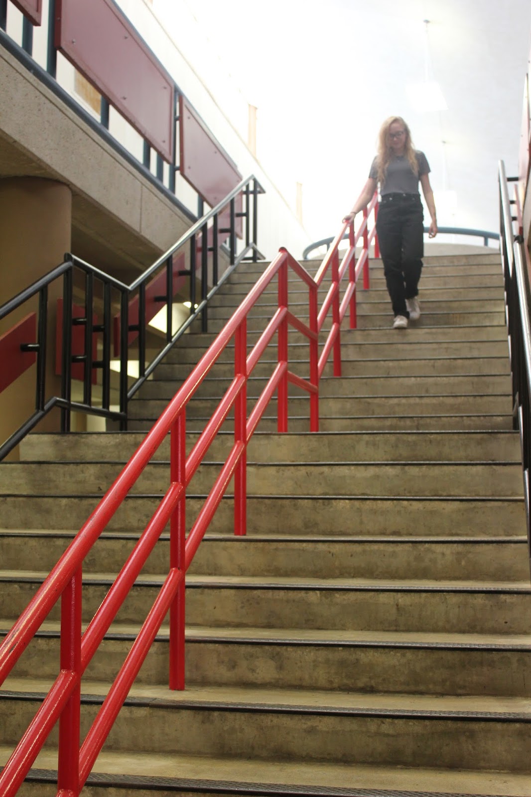
This is my "Happy" photo. In the photo, I used the lines technique. I used the railings on the stairs to lead up to the main subject that's happily walking down the stairs. 

This is my "Bowie" photo. I used the framing technique to make this picture more dynamic. I used the railings on the second floor to frame the main subjects on the first floor.

This is my "Metal" photo. In this picture I tried to use lines, the rule of thirds and simplicity. I only ended up achieving simplicity and lines because the fence isn't really in a third of the frame. It shows simplicity because the subject is the only thing in the photo with a very blank background. This photo also shows lines because the rails on the metal fence create lines throughout the frame.

This is my "Merger" photo. It shows a merger because the girl on the very left is cut off. Almost her entire body is cut off. I also was able to use the rule of thirds in this picture because the subjects are in the left third of the frame. This picture also shows framing because the bush in the bottom right and the tree at the top frames the subjects.

Thursday, September 10, 2015

Avoiding Mergers


This is a picture where the photographer didn't avoid mergers. The photographer cut off the man's head and hand. It also cuts off the man in the background on the right. Mergers are bad because it doesn't show the full effect the picture had the capability of having. Now instead of focusing on the woman, my eye goes to the man's head.

Framing


This photo shows framing because the broken wall creates a frame around the firefighter. This technique makes the photo more dramatic because it shows the heroic firefighter in the midst of the damage. It makes you focus on him, and it shows him as a light in the darkness.